Brief set by Pentagram FOR D&AD
Design of a supplement publication for The Typographic Circle Magazine.
The Typographic Circle stages a series of diverse monthly lectures by well-known industry speakers.
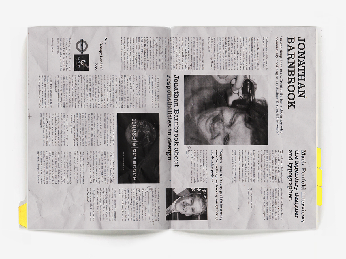
The task was to design a supplement issues that would feature three participant speakers: Jonathan Barnbrook, Anthony Burrill and Rian Hughes.
The Typographic Circle “brings together anyone with an interest in type and typography” hence I decided to use an experimental approach to typography for the body work and layout to bring a bit of life to the “words” as spoken and create a vivid layout, as speech language caught into paper. Combining an uncontrolled grid layout with a grid based on a pentagram figure to give a bit of consistency for the issues.
The issues are collectibles for that reason I decided to use the concept of an archive system.
To emphasise the archive concept, simple numeric equivalent to letters has been used for the naming of the issues, and were stamped on the front cover. (a=1, b=2, c=3).
Pages were divided by color dividers. Each colour is unique for each folder corresponding to the speaker featured in the issue.
Eg: Jomathan Barnbrook - YELLOW, Anthony Burril - PINK
Cover material: recycled paper.


In addition I've made a custom rubber stamp of the Typographic Circle logotype.


